THE COLOR OF THE STANDS
Who among us didn’t have fun when we went to school, putting crayons in tin boxes by graduation?
And who doesn’t have a favorite color?
It is now a consolidated fact, ascertained by Modern Science that colors have the ability to stimulate our mind, influence our mood, provoke emotions and therefore also influence our choices.
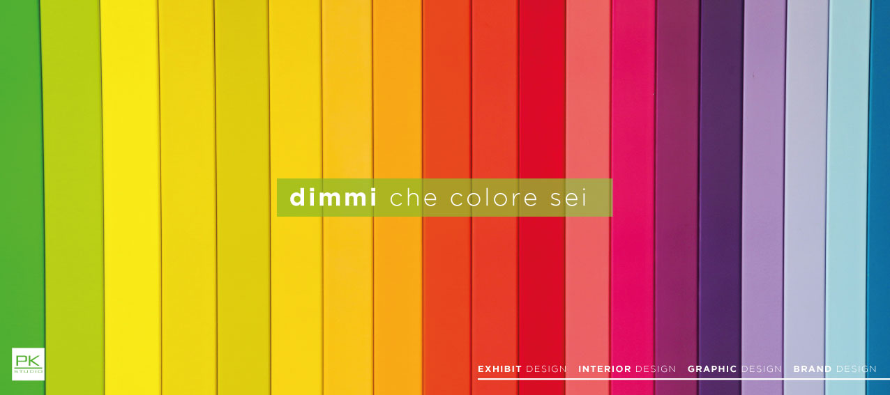
The psychology of colors attributes to RED a stimulating value, which strikes the attention; to YELLOW the idea of joy and optimism similar to ORANGE which restores liveliness and dynamism. BLUE is the color of positivity and seriousness; GREEN is reassuring and linked to issues of nature and finally BLACK, which is the negation of color, is the formalization of elegance and contrasts with WHITE which indicates purity and peace.
Marketing, in particular that branch called neuromarketing, in which the cognitive aspects of the consumer are studied, evaluates how colors influence the consumers’ purchasing decision and their attitude towards a Brand.
From this it follows that a company must correctly analyze its presence at the fair also by evaluating the careful use of the color of the stand and all related communication. It is our job, as Exhibitor Design, to evaluate which color makes the Customer’s stand more appealing, which highlights his logo and which colors enhance his brand overall.
Such an accurate study by our designers and graphic designers, allows us to guarantee the company that relies on PKstudio to participate in a trade fair, a final result of excellent effect, which will stimulate the attention and interest of customers and Stakeholders.